
 English
How to Choose the Right Font Style for Different Types of Content
By AestheticFonts Editorial Team Last updated

Choosing the right font style can make your text look more attractive and easier to read. Whether you are creating an Instagram bio, writing a blog post, designing an invitation, or making a poster, the font you choose can change how people see your message.
The best way to choose a font is to think about your content, audience, and purpose. Simple fonts work well for everyday reading, bold styles help important words stand out, and decorative or fancy text adds personality to short messages. Here is how to choose the right font style for different types of content.
Understand Different Font Styles Before Choosing
Before choosing a font, it helps to understand the main types of font styles. Each one has a different appearance and works better for certain types of content.
- Serif Fonts: These fonts have small decorative strokes at the ends of letters. They give text a traditional, classic, and professional look.
- Sans Serif Fonts: These fonts have clean and simple letter shapes. They are popular for websites, blogs, and digital content.
- Bold Fonts: Bold letters make important words easier to notice. They are useful for headings, titles, and promotional messages.
- Script Fonts: These fonts look similar to handwriting. They are a good choice for invitations, greetings, and creative designs.
- Decorative Fonts: These styles have unusual letter shapes and creative designs. They work well for logos, posters, and short social media messages.
- Monospace Fonts: Each character takes up the same horizontal space. They are commonly used for coding, technical content, and typewriter-style designs.
Understanding these styles makes it easier to find a font that matches your message. You can also try different Unicode font styles to see how your text looks before using it.
Choose the Right Font Style for Social Media Content
Social media is one of the most common places where people use stylish fonts. Instagram bios, Facebook posts, TikTok captions, and usernames often use different text styles to look more interesting.
For Instagram bios, try bold, italic, cursive, or aesthetic Unicode text. These styles can highlight your name, hobbies, or a short personal description without changing the meaning of your words.
For Facebook posts and TikTok captions, bold and decorative text can help important phrases stand out. However, keep the main message simple so people can understand it quickly.
If you are creating a username or profile name, choose a style that matches your personality. Avoid using too many special characters because some devices and apps may not display every Unicode character correctly.
Best Font Styles for Blog Posts and Website Content
For blog posts and websites, readability should come before decoration. Readers usually spend more time with this type of content, so they need a font that is comfortable to read.
Sans-serif fonts such as Arial, Roboto, and Open Sans are popular choices for website content. Serif fonts such as Georgia and Times New Roman can also work well, especially for long-form articles and editorial content.
Use bold text to highlight important words and headings to separate different sections. You can use a decorative font for a short title or special heading, but keep normal paragraphs in a simple font.
Pick Stylish Fonts for Invitations and Greeting Messages
Invitations and greeting messages often need a personal and attractive appearance. A simple message can look more special when you use a font that matches the occasion.
Script and cursive fonts are good choices for wedding invitations, birthday cards, anniversary messages, and thank-you notes. They give the text a handwritten and elegant appearance.
For casual birthday wishes or festival greetings, you can try playful, bubble, bold, or aesthetic Unicode styles. Choose a font that matches the mood instead of using the same style for every occasion.
Choose Professional Font Styles for Business and Work Content
Business content needs to look clear and trustworthy. Whether you are preparing a presentation, business proposal, resume, or company profile, your font choice should support your message.
Sans-serif fonts such as Arial, Calibri, and Helvetica are useful for professional documents and presentations. They have a clean appearance and make information easy to scan.
For a business logo or brand name, you can experiment with bold, modern, or elegant serif styles. Keep the design consistent so people can recognise your brand across different platforms.
Use Bold and Decorative Fonts for Posters and Headlines
Posters and headlines need to catch attention quickly. People often look at them for only a few seconds, so the most important words should be easy to notice.
Bold, display, and decorative fonts are good choices for event posters, advertisements, YouTube thumbnails, and promotional graphics. Large letters can make the main message stand out from the other information.
You can combine a bold heading with a simple font for supporting details. This creates a clear difference between the main message and the information readers need to understand.
Find the Right Font Style for Gaming Names and Usernames
Gaming names and usernames are often used to show personality. Players commonly choose bold, gothic, small caps, and unusual Unicode letter styles to create a different look.
For gaming profiles, try decorative alphabets, circled letters, or stylish symbols. These can make a username look different from ordinary text.
Before using a fancy username, check whether the game or platform supports those characters. Some games only allow a limited set of letters and symbols, so a complicated name may not work everywhere.
Match Your Font Style With the Mood of Your Content
Every font style creates a different feeling. A formal message needs a different appearance from a funny caption or a romantic greeting.
For elegant content, try cursive, script, or serif styles. For modern and simple designs, choose clean sans-serif fonts, while playful messages can use bubble, rounded, or decorative lettering.
Think about what you want readers to feel when they see your text. A good font should support the message rather than distract people from it.
How to Combine Different Font Styles Without Making Text Messy
Using more than one font style can make your content look interesting, but too many different styles can create confusion. A good starting point is to use one main font and one supporting font.
For example, use a bold sans-serif font for headings and a regular sans-serif font for paragraphs. You can also combine a serif heading with a simple sans-serif body font for a different look.
Keep decorative and Unicode fonts for short phrases, titles, or important words. Using several fancy styles in a single paragraph can make the content harder to read.
Check Font Readability Before Using a Stylish Font
A font may look beautiful in a font generator, but that does not always mean it will work well everywhere. Some decorative letters are difficult to recognise, especially when they appear in long sentences.
Check your selected font on both mobile and desktop screens. Also, paste the text into the platform where you plan to use it to see whether the characters appear correctly.
Remember that Unicode stylish text is different from a regular installed font. It uses special characters that look like styled letters, so its appearance and accessibility can vary between devices, apps, and websites.
Try Different Font Styles With a Fancy Text Generator
If you are not sure which font looks best, try a font generator to compare different styles. You do not need to install any font files or learn graphic design to create stylish text.
Simply type or paste your words into the font generator and explore the available styles. You can try bold, italic, cursive, gothic, bubble, small caps, and other fancy text variations.
Once you find a style you like, copy the generated text and paste it into your Instagram bio, Facebook post, gaming profile, invitation, or other supported platform. Always check the final result before sharing it.
Final Thoughts on Choosing the Right Font Style
The right font style depends on what you are creating and who will read it. Simple fonts are usually better for long content, while bold and decorative styles are useful for short messages, headings, and creative designs.
Try different font styles, compare how they look, and choose the one that makes your message clear. A good font does not just make your text look different; it helps your words communicate better.
Share
Related Posts

What Font Does ChatGPT Use? (Font Revealed)
Discover what font ChatGPT uses, learn about OpenAI Sans, explore similar fonts, and create stylish ChatGPT-inspired text.
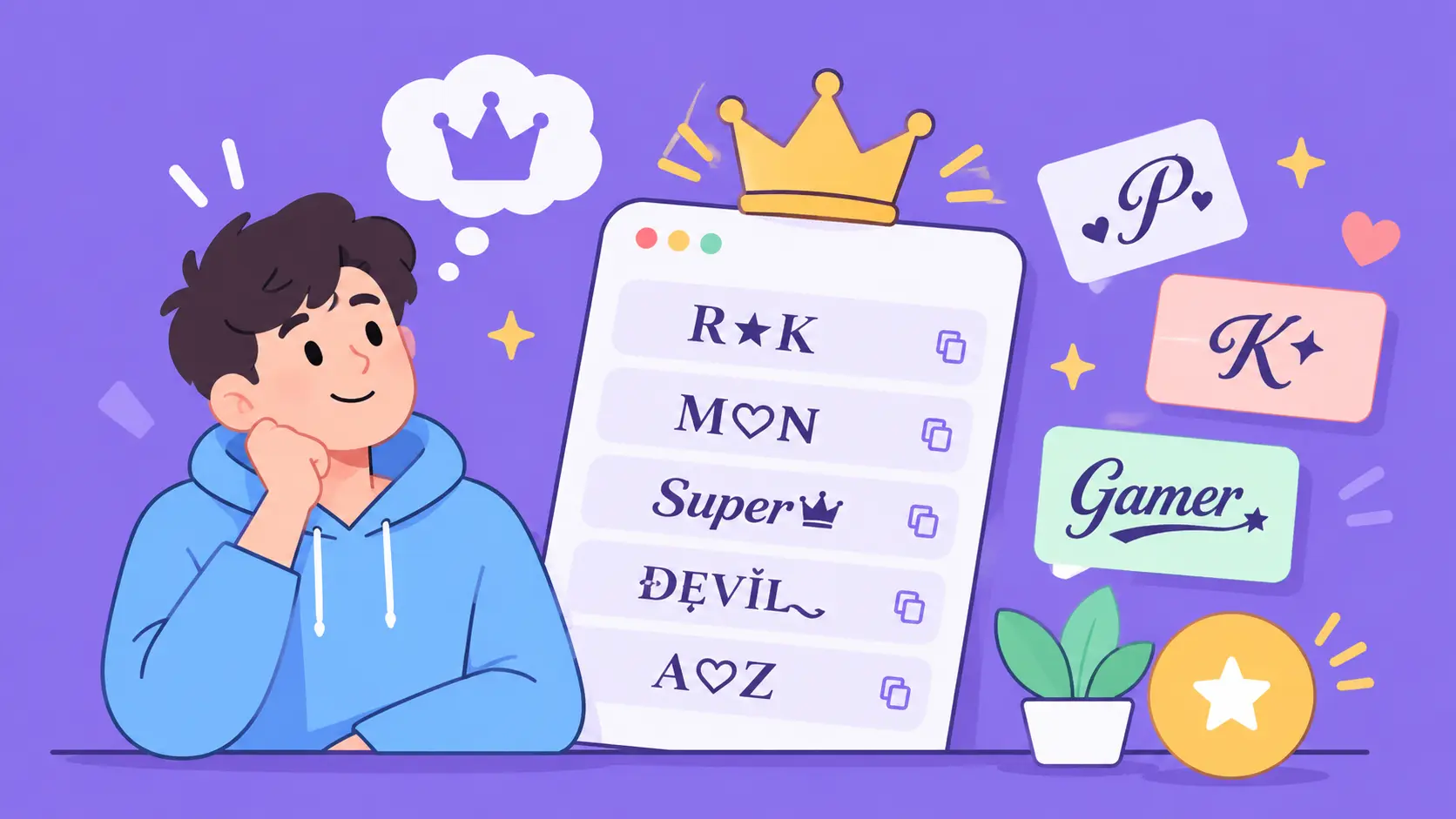
100+ Stylish Letter Combinations for Nicknames to Copy and Paste
Explore 100+ stylish letter combinations for nicknames, including cute, fancy, gothic, cursive, and gaming styles to copy and paste.